 Data Viz Principles
Week 1 | Lesson 4.4
LEARNING OBJECTIVES
After this lesson, you will be able to:
- Describe the characteristics of a great data visualization
STUDENT PRE-WORK
Before this lesson, you should already be able to:
- Open up Tableau and take a look around
INSTRUCTOR PREP
Before this lesson, instructors will need to:
- Slide prep
LESSON GUIDE
| TIMING | TYPE | TOPIC |
|---|---|---|
| 5 min | Introduction | Why use data visualizations? |
| 10 min | Demo | Anscomb's Quartet |
| 25 min | Demo | Visualization attributes |
| 25 min | Demo | Choosing the right chart |
| 20 min | Independent Practice | |
| 5 min | Conclusion |
Introduction: Why use data visualizations? (5 mins)
Because of the way the human brain processes information, using charts or graphs to visualize large amounts of complex data is easier than poring over spreadsheets or reports. Data visualization is a quick, easy way to convey concepts in a universal manner – and you can experiment with different scenarios by making slight adjustments.
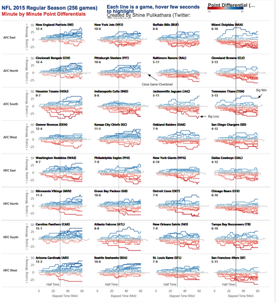
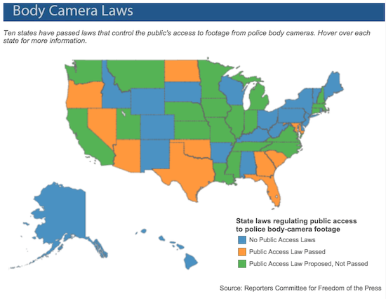
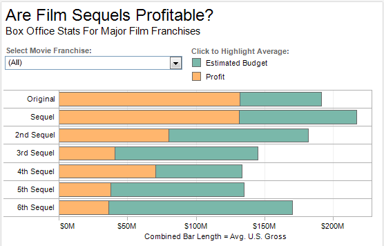
Here is some fun information about data viz.
Demo: Anscomb's Quartet (10 mins)
Here is the summary statistics for four plots. What do you think the visualization for each of these plots would look like?
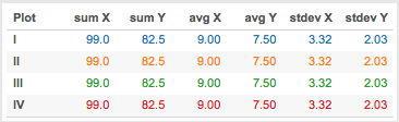
You can probably already guess that the answer is, although the four plots have the same summary statistics, they actually are completely different and this can be seen when we visualize them together.
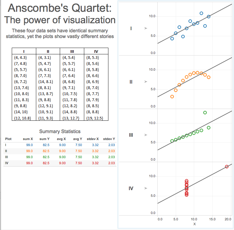
Anscomb's quartet reminds us not to rely completely on just the summary stats of our data. And that, especially during exploratory data analysis (EDA), which we will get to in Week 2, making some exploratory visual plots could keep us from making some incorrect assumptions about our data.
Demo: Visualization attributes (25 mins)
What do you think might be important attributes that a data visualization should have?
Let's take a look at what Jeffrey Shaffer, who teaches data visualization at the University of Cincinnati, thinks is important.
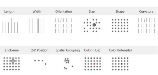
Something really interesting, is that some attributes have more of an effect on our brains. The one we tend to focus on most is position, then color and size.
Let's take a look at three visualizations. Which one of the three catches your attention the most and why?


Let's focus on color for a minute. Generally, in data visualizations, you’re going to use color in one of three ways: sequential, diverging, or categorical.
Sequential colors are used to show values ordered from low to high.
Divergent colors are used to show ordered values that have a critical midpoint, like an average or zero.
Categorical colors are used to distinguish data that falls into distinct groups.
With credit to Jeff Shaffer: data viz attributes
Demo: Choosing the right chart (25 mins)
In addition to taking visualization attributes into consideration, you should also consider carefully, which kind of chart or graph to use. Let's look at a few commonly used charts and graphs.
Bar chart Bar charts are one of the most common ways to visualize data. Why? Because it's easy to compare information, revealing highs and lows quickly. Bar charts are most effective when you have numerical data that splits neatly into different categories.
Pie chart The only time that pie charts should be used is to show relative proportions or percentages of information. Pie charts are the most commonly mis-used chart type. If you want to compare data, leave it to bars or stacked bars. If your viewer has to work to translate pie wedges into relevant data or compare pie charts, key points you might be trying to convey may be missed.
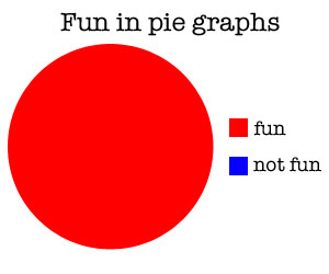
Here is another fun example of pie charts in action.
Note: You shouldn't use pie charts when communicating with technical stakeholders. They are too non-specific and are sort of a joke in dataviz circles.
Scatter plot Scatter plots are a great way to give you a sense of trends, concentrations and outliers. This will give you a good idea of where you may want to investigate further.
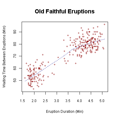
Here is some more information on scatter plot
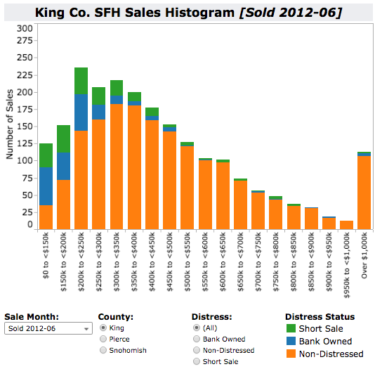
Histogram chart Histograms are useful when you want to see how your data are distributed across groups.
This is not an all inclusive list of the kinds of charts and graphs that one could use, but the point is, there are several types. Consideration should be given to which one is most appropriate to represent a particular data set.
Click here for more charts and graphs.
Independent Practice: Topic (20 minutes)
- Create a Tableau visualization. Try to keep in mind all the points that were made above.
- Share it with a partner. What's the first question they ask you?
Conclusion (5 mins)
- Why is visualization so important?
- What are some things to keep in mind when creating a visualization?
- Describe when you would use particular types of charts or graphs.
- bar chart?
- pie chart?
- scatter plot?
- histogram chart?