 Introduction to Material Design
LEARNING OBJECTIVES
After this lesson, students will be able to:
- Describe the concept of tangible surfaces as they relate to material design
- Describe how themes, primary/secondary colors, etc apply to styling an application
- Explore material design assets and libraries
- Relate how animation and meaningful motion connects to user interfaces and interaction
STUDENT PRE-WORK
Before this lesson, students should already be able to:
- Create XML layouts
Opening (5 mins)
Before we talk about Material Design, take 5 minutes to answer the following question:
Why is it called material design?
Introduction: Material Design (5 mins)
Material Design is a newer design specification, developed by Google, that defines guidelines for apps to be bold yet simply designed.
These guidelines are meant to unify the interfaces of multiple apps across multiple platforms. Although they are not designed exactly the same way, all apps that use Material Design feel related because they all use similar assets and guidelines.
The material in Material Design is referring to paper. The specifications are there to make an app feel more real.
Again, the goal is not to have the app look real, but to feel real. When a user interacts with your app, it should react to their touch as if the user were interacting with a sheet paper on the table. It should move responsively and realistically.
Paper can also split and peel, it can be pushed around, stacked atop each other, and can contain ink that defines its content.
Check: How does Material Design relate to real world objects?
Demo: (Video) Making Material Design (10 mins)
Let's watch the following to see the thought process of the designers at Google as they create Material Design.

https://www.youtube.com/watch?v=rrT6v5sOwJg
Demo: Utilizing color (20 mins)
Apply the Material theme
To provide system widgets that are updated with material design, you apply a material theme.
In res/values/styles.xml:
<resources>
  <style name="AppTheme" parent="Theme.AppCompat.Light.DarkActionBar">
    <!-- theme customizations -->
  </style>
</resources>
This is the baseline for your app's feel and color.
Make sure your app is using your defined theme in the Android Manifest xml, under the application tab:
  <application
      android:theme="@style/AppTheme">
    <!-- Activities go here -->
  </application>
Primary, Secondary, and Accent color
When you have time, take a look at Material Design color Palette for a good related reading.
The theme you define in your styles.xml is applied to the whole app. In it, you can define custom colors that will define the app's main colors.
The primary color is your app's branding color. For a store like Target, their primary color would be red, and their whole store is designed around it. The primary color is the one most widely used. It defines the color of the toolbar.
The secondary color is usually a darker or lighter version of the primary color. It's used to relay related information.
The accent color provides a contrast to the other colors, usually much different. It's not used as much as the primary color, but is there to highlight interactive elements on the screen. It separates the element from the rest of the app, giving it more importance.
Check: Of the following, what are the primary, secondary, and accent colors?
 https://www.youtube.com/watch?v=32i7ot0y78U
## Demo: Importing these widgets (10 mins)
For most of you, the Material theme was already applied to your apps! Meaning, your views were already material, and your apps were already material-ish. The theme utilizes a lot of the [Google Design Specifications](https://www.google.com/design/spec/material-design/introduction.html), so you don't have to worry about too much of it.
However, not all of the material widgets are included in your projects by default, depending on your project.
If you use a template with Material-like icons, like the **blank** activity or the **scrolling** activity, the design elements are already imported. Otherwise, you'll have to import them yourself.
To do that, open up your **build.gradle** and add the following inside the dependencies block:
```gradle
dependencies {
compile 'com.android.support:appcompat-v7:23.1.1'
compile 'com.android.support:design:23.1.1'
}
```
This adds the design library to your app, importing additional widgets that follow the Google Design Specs.
## Demo: Material design widgets (25 mins)
> Instructor note: Encourage students to follow along if they would like.
You can see the contents of the full library here: [http://android-developers.blogspot.com/2015/05/android-design-support-library.html](http://android-developers.blogspot.com/2015/05/android-design-support-library.html)
We'll be discussing a few of the views used in material design often.
#### Toolbar
*Included in the AppCompat v7 library.*
https://www.youtube.com/watch?v=32i7ot0y78U
## Demo: Importing these widgets (10 mins)
For most of you, the Material theme was already applied to your apps! Meaning, your views were already material, and your apps were already material-ish. The theme utilizes a lot of the [Google Design Specifications](https://www.google.com/design/spec/material-design/introduction.html), so you don't have to worry about too much of it.
However, not all of the material widgets are included in your projects by default, depending on your project.
If you use a template with Material-like icons, like the **blank** activity or the **scrolling** activity, the design elements are already imported. Otherwise, you'll have to import them yourself.
To do that, open up your **build.gradle** and add the following inside the dependencies block:
```gradle
dependencies {
compile 'com.android.support:appcompat-v7:23.1.1'
compile 'com.android.support:design:23.1.1'
}
```
This adds the design library to your app, importing additional widgets that follow the Google Design Specs.
## Demo: Material design widgets (25 mins)
> Instructor note: Encourage students to follow along if they would like.
You can see the contents of the full library here: [http://android-developers.blogspot.com/2015/05/android-design-support-library.html](http://android-developers.blogspot.com/2015/05/android-design-support-library.html)
We'll be discussing a few of the views used in material design often.
#### Toolbar
*Included in the AppCompat v7 library.*

There are two elements to be aware of: Toolbar and Action Bar.
Action Bar is the default view that sits atop your apps. It's existed since the beginning of Android. You can add a drawer to it, menu items, change its title, etc.
The problem with it is that it's not very flexible. You can't change the dimensions of it, the background, the position, etc. You don't have full access to it.
That's where Toolbar comes in. Toolbar is, essentially, an Action Bar. However, Toolbar is just a view. Like any other view, you can change how it's displayed, place it anywhere in your layouts, etc.
Here's how you include it in your layouts:
<android.support.v7.widget.Toolbar
    android:id=”@+id/toolbar”
    android:layout_height=”wrap_content”
    android:layout_width=”match_parent”
    android:minHeight=”?attr/actionBarSize”
    android:background=”?attr/colorPrimary” />
... and here's how you refer to it in your java classes:
@Override
    public void onCreate(Bundle savedInstanceState) {
        super.onCreate(savedInstanceState);
        setContentView(R.layout.activity_main);

        Toolbar toolbar = (Toolbar) findViewById(R.id.toolbar);
        setSupportActionBar(toolbar);
    }
The last line, setSupportActionBar(toolbar); is replacing the default action bar with your toolbar.
At this point, you may see both the action bar and the toolbar crashed. In both cases, since you're using your own toolbar, you should hide the action bar. You do that in your app theme:
<resources>
    <style name="AppTheme" parent="Theme.AppCompat.Light.DarkActionBar">
        <!-- other items above -->
        <item name="android:windowNoTitle">true</item>
        <item name="windowActionBar">false</item>
    </style>
</resources>
Floating Action button
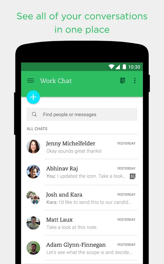
You've probably seen (or used) this view a few times already. The Floating Action Button (FAB) is used to show a main action in an activity.
For example, for a phone dialing app, the FAB would be the call button. For Gmail, this is the Create New Email button.
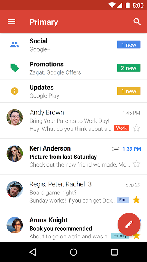
Usually, there are only one FAB in an activity.
Here's how you add it to your layouts:
<android.support.design.widget.FloatingActionButton
            android:id="@+id/fab"
            android:layout_width="wrap_content"
            android:layout_height="wrap_content"
            android:src="@drawable/ic_plus_sign" />
Just like an image view, you can provide a source image to your button, usually an icon that describes what the button is doing.
Here's how to reference it in java:
    FloatingActionButton fab = (FloatingActionButton) findViewById(R.id.fab);

    myFab.setOnClickListener(new View.OnClickListener() {
        public void onClick(View v) {
            doSomething();
        }
    });
At that point, it acts like a regular button.
Card View
Cards are used a lot in Material Design. Some may argue that it is the main driver of it.
A Card View is a layout type (it extends FrameLayout). It allows you to display information consistently across your app.
First, it's separate from the design library. You import it to your build.gradle dependencies:
compile 'com.android.support:cardview-v7:21.0.+'
Then, just like any other view, you put it in your layout:
    <!-- A CardView that contains a TextView -->
    <android.support.v7.widget.CardView
        xmlns:card_view="http://schemas.android.com/apk/res-auto"
        android:id="@+id/card_view"
        android:layout_gravity="center"
        android:layout_width="200dp"
        android:layout_height="200dp"
        card_view:cardCornerRadius="4dp">

        <TextView
            android:id="@+id/info_text"
            android:layout_width="match_parent"
            android:layout_height="match_parent" />
    </android.support.v7.widget.CardView>
You should set the width and height, and optionally set the cardCornerRadius, cardElevation, and cardBackgroundColor.
Conclusion (5 mins)
- How does material design in apps relate to real world objects?
- What types of material design widgets can you use in your applications?
Additional resources
Google Developers - "Paper and Ink: The Materials that Matter"